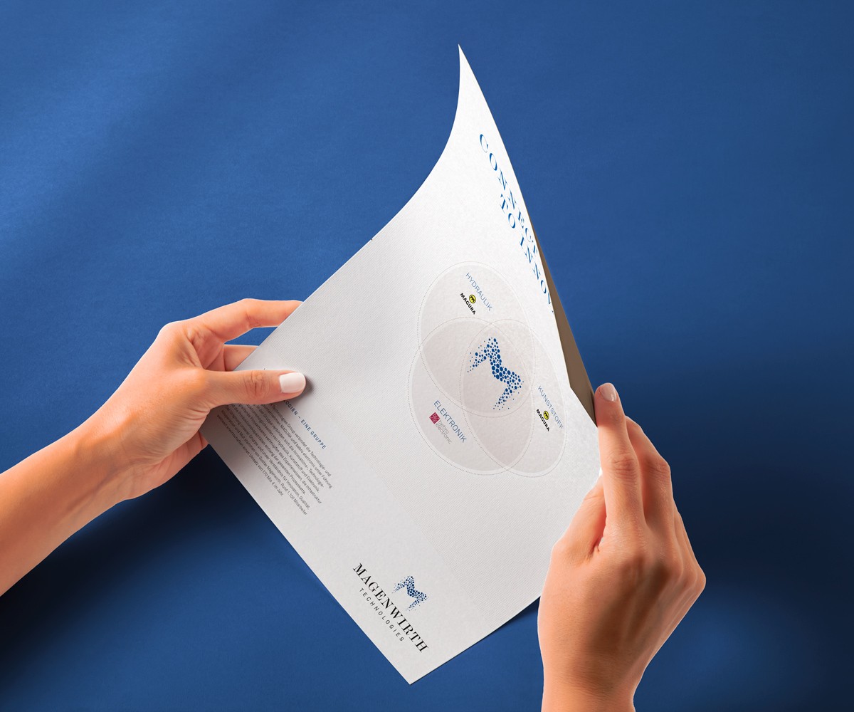
The project focused on developing a shared identity for three brands among nine companies and eleven diverse manufacturing locations in the plastics, hydraulics, and electronics industries.
The aim is to unite the unique qualities of each brand while preserving their shared heritage.
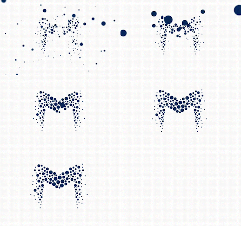
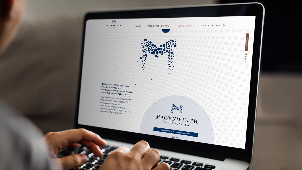
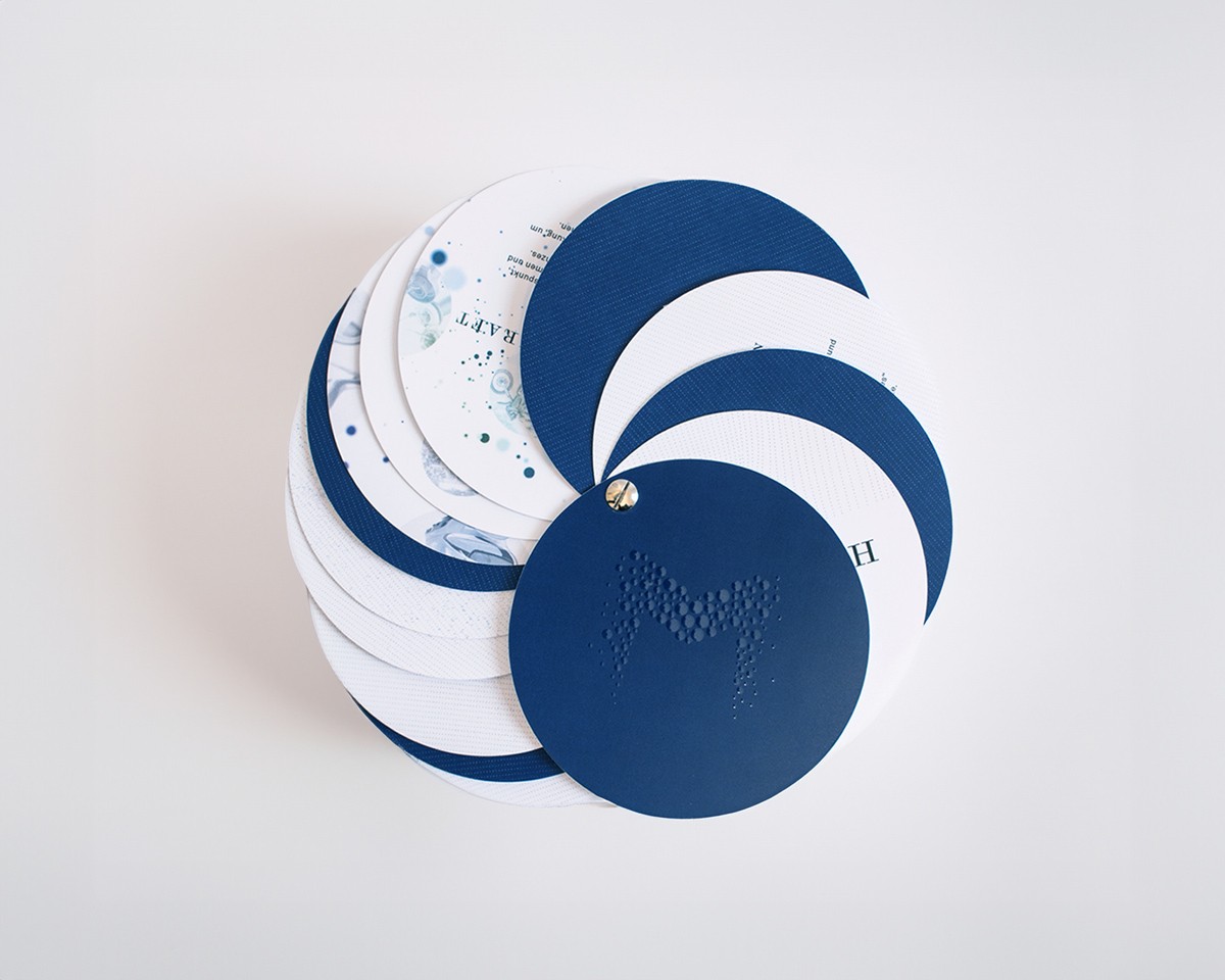
The Dot-M Logo
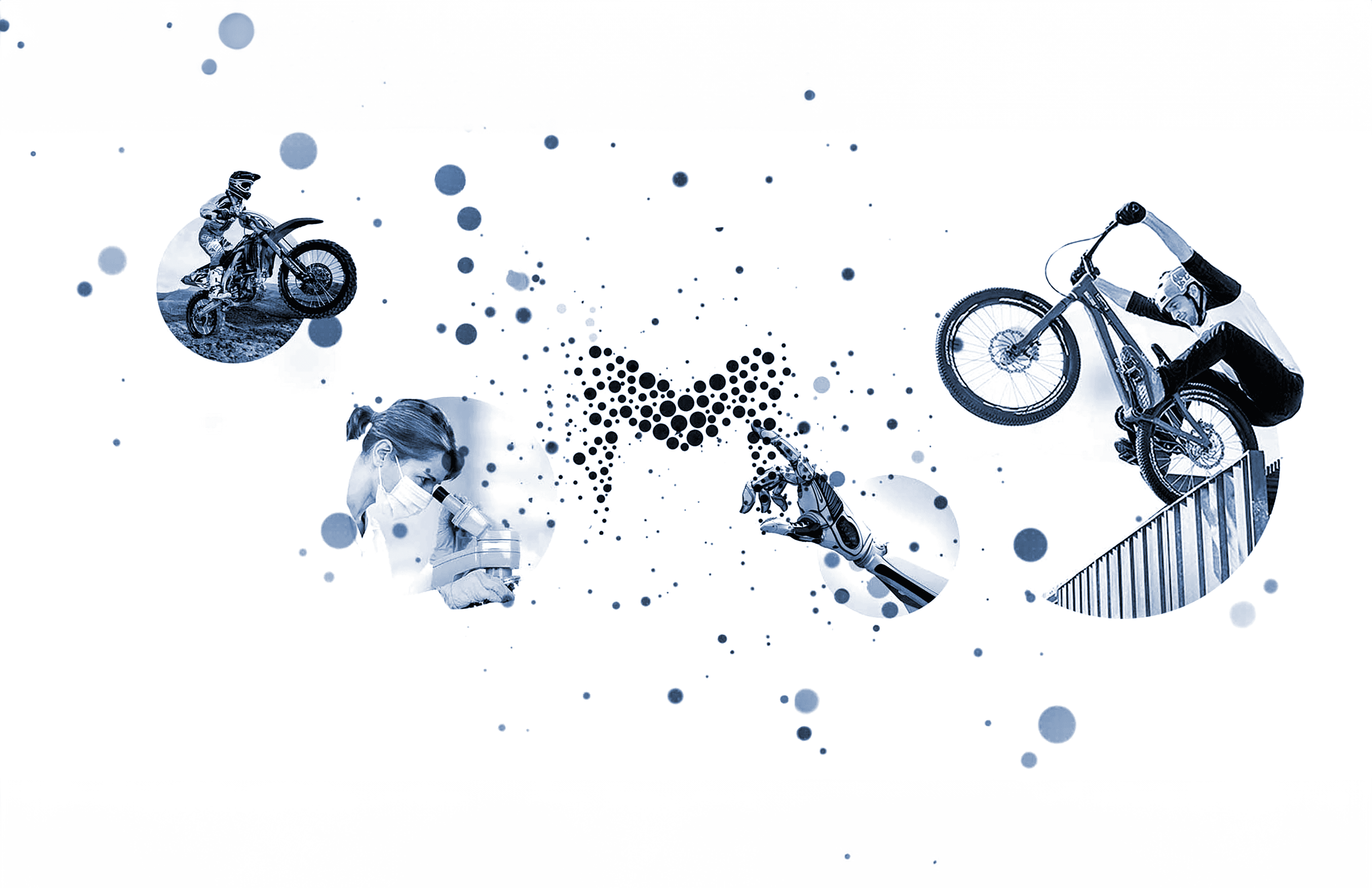
creates connections between various technologies and services by leveraging the unique properties of dot textures, and the principles of expansion and implosion.
The logo serves as an effective communication medium that facilitates seamless integration to foster a culture of collaboration and innovation.
CI / CD - Handling
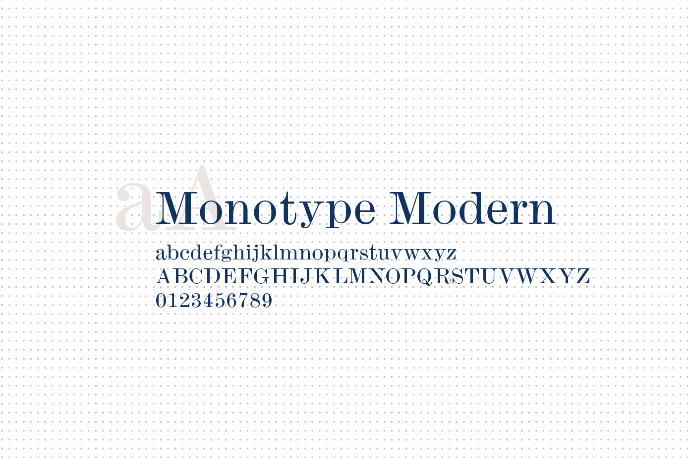
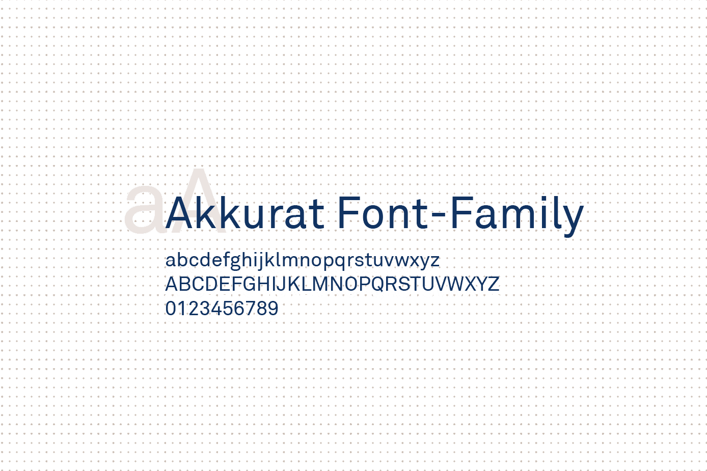
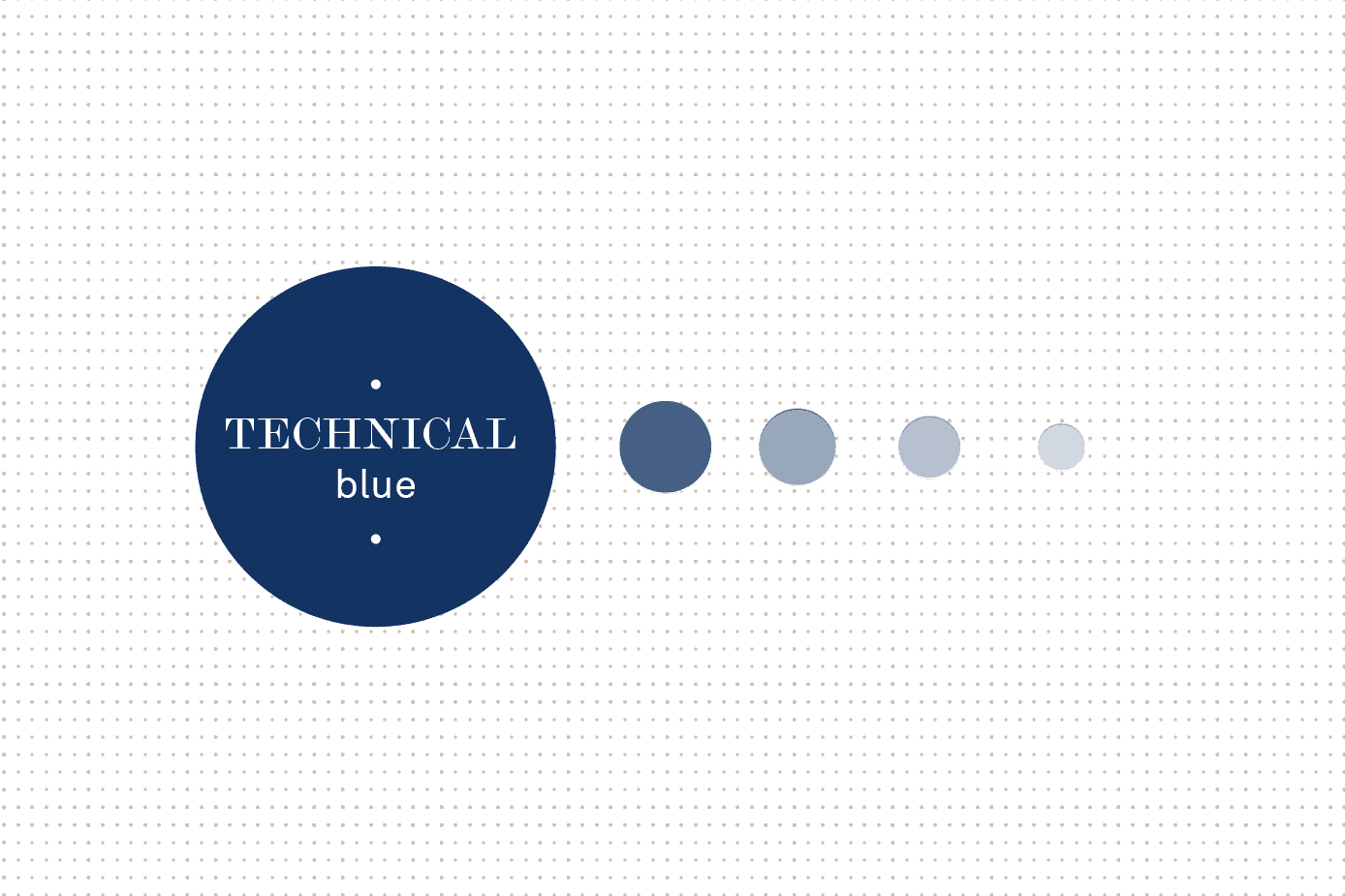
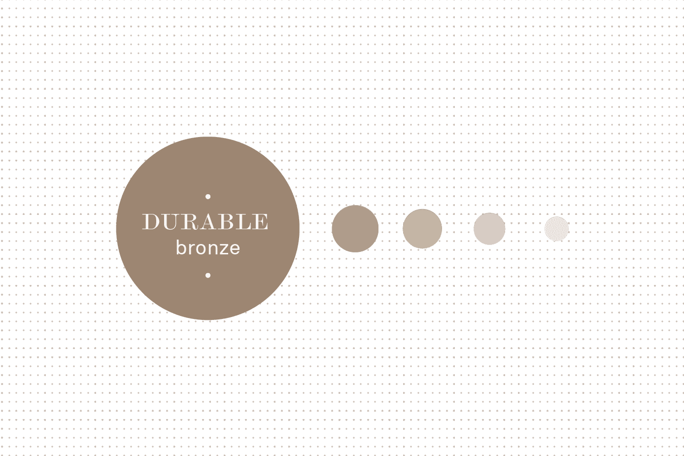
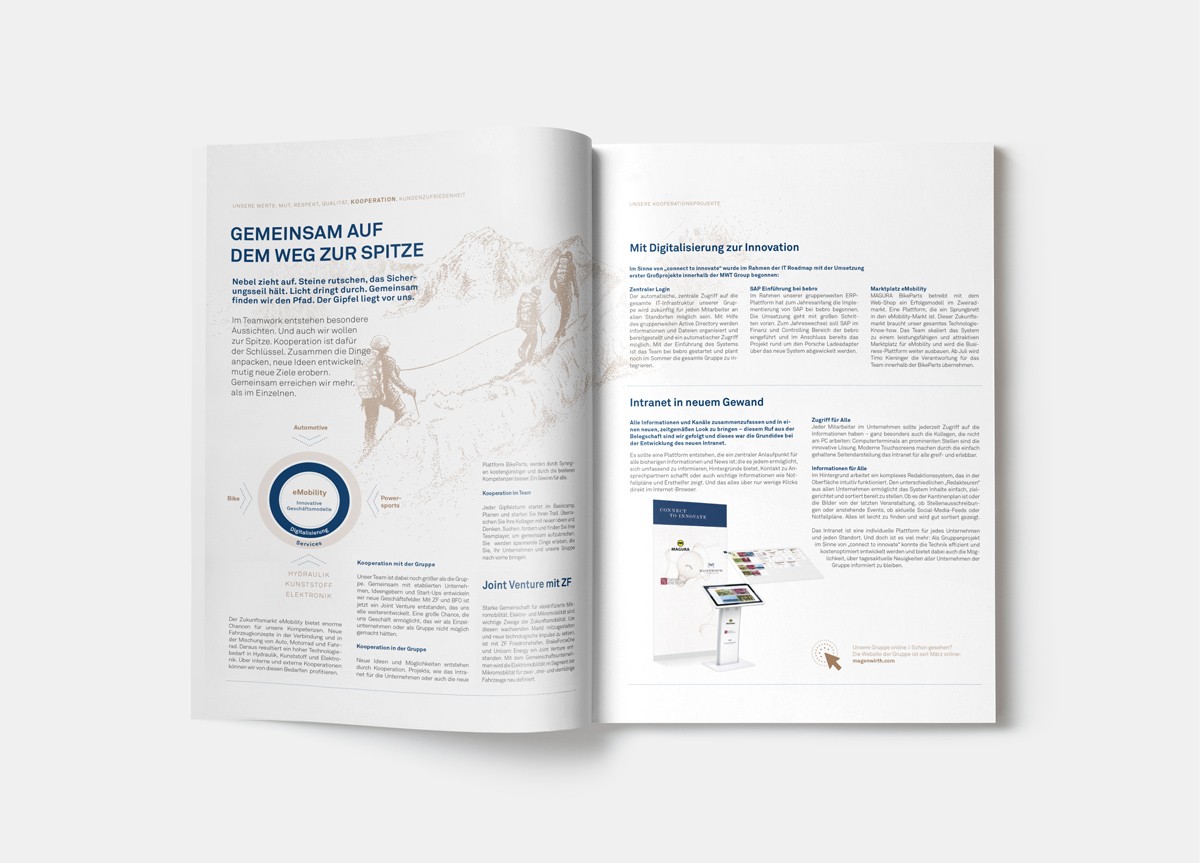
Amidst a sea of designs, the blend of blue and bronze emerges, exuding elegance and timelessness. The use of the Monotype Wide in headings imparts a sense of tradition and sophistication, while the Akkurat for body text ensures modern clarity.
Together, they elicit a sense of trust and innovation (blue), along with creativity and uniqueness (bronze).
Showcase
final design elements
